Showing posts with label paintings. Show all posts

Monday, 7 February 2022

This woman sees 100 times more colours than the average person

 A unique genetic mutation and a well-wired brain mean that Concetta Antico is like no other artist on Earth.

When Concetta Antico looks at a leaf, she sees much more than just green. “Around the edge I’ll see orange or red or purple in the shadow; you might see dark green but I’ll see violet, turquoise, blue,” she said. “It’s like a mosaic of color.”


Antico doesn’t just perceive these colors because she’s an artist who paints in the impressionist style. She’s also a tetrachromat, which means that she has more receptors in her eyes to absorb color. The difference lies in Antico’s cones, structures in the eyes that are calibrated to absorb particular wavelengths of light and transmit them to the brain. The average person has three cones, which enables him to see about one million colors. But Antico has four cones, so her eyes are capable of picking up dimensions and nuances of color—an estimated 100 million of them—that the average person cannot. “It’s shocking to me how little color people are seeing,” she said.


Concetta Antico 

“You might see dark green but I’ll see violet, turquoise, blue. It’s like a mosaic of color.”


Although tetrachromats have more receptors in their eyes, their brains are wired the same way as a person with normal vision. So how can a brain like Antico’s change to see more colors? Like anything else, practice makes perfect, even when it comes to neural pathways.


For years, researchers weren’t sure tetrachromacy existed. If it did, they stipulated, it could only be found in people with two X chromosomes. This is because of the genes behind color vision. People who have regular color vision have three cones, tuned to the wavelengths of red, green, and blue. These are connected to the X chromosome—most men have only one, but most women have two. Mutations in the X chromosome cause a person to perceive more or less color, which is why men more commonly have congenital colorblindness than women (if their one X chromosome has a mutation). But the theory stood that if a person received two mutated X chromosomes, she could have four cones instead of the usual three.


This is the case with Antico; researchers confirmed that she is a tetrachromat in 2012. One percent of the world’s population is thought to be tetrachromatic, but it’s not easy to demonstrate empirically. “The difference between [the color dimensions perceived by] a tetrachromat and someone with normal vision is not as dramatic as the difference between someone who is colorblind and someone with normal vision,” according to Kimberly Jameson, a cognitive scientist at the Institute for Mathematical Behavioral Sciences at the University of California in Irvine. She and her colleague Alissa Winkler at the University of Nevada in Reno have been studying Antico for about a year to better understand tetrachromacy. The differences in color perception are hard to detect because they’re small, Jameson said, but the tests that are currently used are not designed for more than three pigments–red, green and blue.


Based on Antico’s genes, Jameson has determined that Antico’s fourth cone absorbs wavelengths that are “reddish-orangey-yellow, but what it appears to Concetta is uncertain at the moment,” she added. Since the tests aren’t calibrated for this wavelength, empirically demonstrating tetrachromacy is still really difficult.


Jameson and Winkler are on the hunt for more tetrachromats in order to better understand how their brains work. Jameson became fascinated with how people are able to form and communicate concepts, especially when the way they perceive the world can vary so widely. “If you have an extra cone class in the retina, that greatly complicates how that signal might be taking shape as it leaves the retina. We want to understand how that’s happening,” she said. This likely has to do with how the brain wires itself when it receives certain signals frequently over time—a concept called neuroplasticity. Lots of studies about neuroplasticity in animals and some in humans have shown that two individuals with the same capacity for visual perception can have drastically different vision later in life just based on what they were exposed to early on. Researchers still aren’t totally sure why this is the case. “One possibility is that the system learns how to use these signals—the wiring creates the proper code so they can be used in the cortex,” Jameson said.


So even though many more tetrachromats may exist in the world, they may not have exceptional color perception, because they haven’t trained their brains to pay attention. Antico, in this case, presents a rare exception. “I was different than a regular 5-year-old — I was painting at age 7, I was so fascinated with color,” she said. For years, she was exposed to exceptional color, so her brain became wired to take advantage of her tetrachromacy.


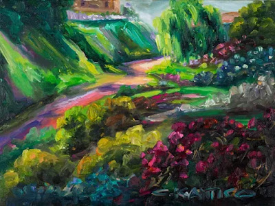
“Rainbow Gully, Mission Hills, SD” ConcettaAntico.com


Antico has a personal stake in the continued research of tetrachromacy. Five years ago, when Antico’s daughter was 7 years old, the family learned that she was colorblind. “I didn’t think it had anything to do with me, but she’s colorblind because of me. I have a mutation,” Antico said. The more she helps scientists understand tetrachromacy, she figures, the better they will be able to help people like her daughter. “If we understand genetic potential for tetrachromacy and how their perception differs, we can understand quite a lot about visual processing of color that we currently don’t understand,” Jameson agreed.


But Antico may have stumbled upon a different way to help those who are color deficient. She is a professional artist who has been teaching painting for over 20 years, and she has a number of students who are colorblind. “One of the things that has been made apparent by looking at their artwork is that they have a good appreciation for color, unlike any other individual who I’ve ever seen that is color deficient,” Jameson said. “It’s very possible that by being tuned in from a very early age to color differences, [Antico] may have acquired some understanding and articulation for how to help them do that.” This hypothesis still needs to be proven empirically, of course, but Jameson is intrigued by the prospect of improving people’s perception of color through the training that neuroplasticity allows.


In addition to spending her time helping researchers better understand tetrachromacy, Antico hopes to open an art school for the colorblind and create an online platform for people around the world to discover if they are tetrachromatic. “I want to be sure before I die that I’m able to define tetrochromatism,” she said. “There have to be more tetrachromats out there. Maybe I can lead the way for that.”


(Source: Popsci)

Thursday, 10 June 2021

India’s vibrant and idiosyncratic truck art

 The drivers go to great lengths to beautify their trucks, which are also their homes.

An apsara dances in a diaphanous skirt, small yellow daffodils blossom, a menagerie of tigers and elephants roam in the midst of wing-flapping birds — all of these come to life together on the steel panels of India’s trucks. Hand-painted symbols, elaborate patterns, and quirky slogans with bold typography coalesce into vibrant, idiosyncratic artworks. Truck art has been a part of India’s visual lexicon and heritage for decades. Highways transform into runways for chunky vehicles drenched in hues of tangerine, canary, plum, and jade green.


A truck driver poses in his truck (all images courtesy All India Permit)


In India, trucks play a pivotal role in transporting heavy-duty goods, journeying for endless kilometers across the country. Most drivers are on the road for weeks, sometimes months at a stretch, living a nomadic life and often sleeping and eating in their vehicles. Their trucks become their travel companions and their homes, and the drivers go to great lengths to beautify them. They work closely with truck artists, describing the illustrations they would like to see.


Sanjay ji, a truck artist is at work. Newspapers are used to block areas which will be painted separately. (photo by Manjot Singh Sodhi)


“A good artist should have a steady hand and an intuitive understanding of color-pairing,” said Raj Dongre, in Hindi, over the phone. He has been embellishing trucks with his designs for over three decades. Before the country was engulfed by the pandemic, he worked in a truck-building workshop in Nagpur. In the summer heat, wearing scruffy clothes, he would dip his brush in colors of indigo and green, and glide it across the truck’s sturdy body, defining the fine feather wisps of a peacock. His hands moved with adept flourish, while songs from old Bollywood films played on his mobile phone.


Inside a trucker’s cabin. The drivers, who are on the road for months, decorate the interiors of their cabins, where they sleep and eat. (photo by Manjot Singh Sodhi)


From golden-crested eagles to ruby-lipped roses, he has drawn them all. The handiwork on the truck — from the crown to the number-plate — is a patchwork of the truckers’ emotions, aspirations, faiths, and cultural roots. “One of the common motifs painted on trucks is a white cow nuzzling its calf,” explained Dongre. “It reflects the driver’s yearning for his mother while he is on the road, or the understanding that he will always be protected by her. The eagle represents speed, but also the feeling that no matter how far it flies, its eye will always be towards its home.”


A superstitious totem often seen on the bumpers is the nazar battu: the mug of a sharp-toothed demon with matted hair, believed to ward off the evil eye. Graffitied catchphrases like “Horn OK Please” and “Use Dipper at Night” (the latter encourages other drivers to dim their headlights at dusk) are now an inextricable part of the truck nomenclature.


A truck artist with his paint cans. The artists work without gloves and use turpentine to remove paint from their hands. (photo by Ishika Aggarwal)


The graceful art form had an unlikely beginning. Cargo trucks predominantly began plying Indian roads during the World Wars. Deployed as armory vehicles, they sported a mean camouflage look. “After the Second World War, however, the trucks were made available to the public for transportation of goods and passengers,” explained Farid Bawa over the phone, an Indian designer based in the Netherlands who collaborates with truck drivers back home. 


A trucker’s love for his country, “India is Great” (photo by Farid Bawa)


Bawa’s family is deeply rooted in the truck business: he grew up watching over a dozen skilled artists at his family-owned truck yard. “Anecdotally, it’s said that because the vehicles looked scary, not many people wanted to sit in them,” he shared. So, the local artists stepped up with their bright paint cans and gave them their campy avatar.


‘Cheel’ (Kite) by Mohammed Shabir (photo by Farid Bawa)


Over the last six years or so, however, he has noticed a precipitous dip in the art form. With the arrival of pre-painted trucks and radium stickers, homegrown artists from small towns and villages whose livelihoods depend on it are being forced to find work elsewhere. 


A freshly painted truck at a truck yard called “Bunty & Anand Body Works” in Nagpur, India (photo by Manjot Singh Sodhi)


“Hand-art is getting neglected,” said truck artist Akhlaq Ahmad, who has been in the field for the last 20 years. “Many drivers prefer pasting radium stickers all over their trucks, because it’s new.” The adhesive-backed pictograms are cheap, and the truckers save time by slapping them on, rather than waiting three to four days for the paint to dry. 


Ahmad frowns upon the stickers, noting that “with hand-drawn art, each truck driver can tell his story. In comparison, the radium stickers are all alike and don’t offer any kind of uniqueness.”


Raj Dongre painting the “nazar battu” to keep the evil energies away. (photo by Manjot Singh Sodhi)


To preserve and promote the country’s ephemeral art tradition, Bawa launched All India Permit (AIP) in 2018, an art project which collaborates with local truck artists. AIP supplies them with Cold Rolled steel sheets on which they paint their vibrant creations. In turn, these pieces become one-of-a-kind collectors’ items, available for sale. A sizable portion of the proceeds goes to the artists, providing them with financial sustenance, particularly during the ongoing quarantine period. AIP’s online platform showcases the artworks, while educating visitors of the art form’s cultural relevance.


“Blow Horn” is a common phrase painted on trucks. (photo by Manjot Singh Sodhi)


“Unfortunately, I think this might be the last generation of truck artists,” speculated Bawa. “Many want their children to work in air-conditioned offices, not on rough highways. Also, there is [financial] uncertainty in this field.” While both Ahmad and Dongre don’t want their kids to inherit their profession, they believe that truck art will never peter out. 


“Otherwise,” Dongre mused, “the Indian highways will be gloomy and bare forever.” 


(Source: HyperAllergic)

Wednesday, 2 June 2021

Rare childhood portraits of Frida Khalo captured by her fgather

 Artist Frida Kahlo is probably best known for her painted self portraits, but she also had a well-documented life on camera. There are hundreds of photographs taken of her as an adult with husband Diego Rivera, but what's less common are images from her childhood. Her father, Guillermo Kahlo, often captured her as a young girl on film. These rare and beautiful images give us a glimpse into what Kahlo's early life was like.

Her family grew up in what's now known as La Casa Azul (the blue house), named that because of its cobalt walls. 


She had a lot of women in her life: her mother Matilde, four sisters, and two half-sisters that also lived with her. These photographs highlight a coming-of-age that's surrounded by family, friends, and a lot of love. Kahlo holds gorgeous bouquets of flowers, a prized doll as well as donning a man's suit and cane.


Even as a young child, Khalo's face was instantly recognizable. Her intense gaze was matched with strong eyebrows that permeated her later artworks.


Age 4, 1911


Age 5, 1912


Age 6, 1913


Frida (far right) age 12, with sister Cristina (left) and best friend, Isabel Campos (center), 1919


Frida dressed in drag (center), with sisters Adriana and Christina and cousins Carmen and Carlos Verasa, 1926


Age 18, 1926


(Source: My Modern Met)

Monday, 10 May 2021

Helen Frankenthaler and the Messy Art of Life

 With her innovative soak-stain paintings, Frankenthaler embraced color for its own sake, animating and elevating the most elemental sensations.

The American painter Helen Frankenthaler always resisted being treated as a “woman painter,” on the ground that artists should never be asked to be representative of anything except their art. Yet Frankenthaler’s life as an artist does make one think hard about adversity and resilience. Impediments impede; they can also inspire. Anyone who goes to Venice to admire the unimaginable richness of the pictures in its churches will find, on retreating to the museum in the Venetian ghetto, where the Jews were forced to pay their jailers to lock them up, that the visual art made by the persecuted was much less compelling than the art of the people who persecuted them. But, then, art is an outlier activity. In the Victorian age, a majority of the great novelists were women (only Dickens and Trollope hold up as well as the Brontës, Eliot, and Mrs. Gaskell); in the United States, all the most interesting mid-twentieth-century musicians were African-American. In some instances, oppression can stifle artistic expression; in others, it can serve as a forcing house for it. Often, both things happen at once, or differently to different people.


Frankenthaler’s breakthrough emerged, as she recalled, from a “combination of impatience, laziness, and innovation.”Photograph by Alexander Liberman / Courtesy the Getty Research Institute © J. Paul Getty Trust. Getty Research Institute, Los Angeles (2000.R.19). Artwork © 2021 Helen Frankenthaler Foundation, Inc. / Artists Rights Society (ARS), New York


Now the Stanford art historian Alexander Nemerov brings us a new biographical work, “Fierce Poise: Helen Frankenthaler and 1950s New York,” concentrating on a key decade in the painter’s career. His is one of those books (Stephen Greenblatt’s “Will in the World” was a sterling example) in which a distinguished scholar says, in effect, to hell with being a distinguished scholar—I’m going to write like a human being. Nemerov refers to his subject not as Frankenthaler but as Helen—very much against the grain of current biographical practice—and he apologizes, in an affecting preface, for having been too much the pedantic puritan, early in his career, to fully appreciate her. The project even involves a sort of apology to his father, Howard Nemerov, the poet (and the brother of the photographer Diane Arbus), who was a teacher, friend, and admirer of Frankenthaler’s. When Nemerov taught an art-history survey class at Yale a dozen years ago, he made the decision, he tells us, to teach art as art, rather than as encoded political cartooning or as social history in pictures. “I abandoned my expertise,” he writes. “I let go of the skepticism I hid behind as a younger man. I left no scrim or safety net between me and the students, between me and the art, between me on the stage and the person I was alone. I began speaking—I don’t know how else to say it—as a person moved.”


Frankenthaler is not an entirely obvious heroine for our moment; even in her own day, she stood out for her good fortune. She was born in 1928, the daughter of a much admired New York State Supreme Court justice, and grew up on Park Avenue. The youngest and the prettiest of three daughters, she was very much her father’s favorite; she had a haunted relationship with her imposing mother, Martha, herself an unfulfilled artist. (Martha, caught in depression by Parkinson’s, committed suicide, decades later, by jumping from her apartment window.) Frankenthaler had a classic upper-Manhattan upper-middle-class education, switching from Brearley to Dalton, a move from an atmosphere of earnest progressivism to one of even more earnest progressivism. She also took art classes from the Mexican modernist Rufino Tamayo, and she knew that she wanted to paint. Nemerov’s book, to its credit, depicts her art not as a collision of art-historical icebergs but as the result of a personal practice, of nonverbal habits, of a way of being in the world. He tells us that, as a child, Frankenthaler delighted in drawing a single line of chalk tracing her route from the Metropolitan Museum to the family’s apartment blocks away—the opening scene of her bio-pic, surely—and loved to take her mother’s red nail polish and spill it in the sink, just to see the patterns it made—a surer sign of a painterly sensibility than museumgoing, although she certainly went to lots of museums.


But Nemerov doesn’t discount the effects of Frankenthaler’s enlightened education. In 1949, she graduated from Bennington, then a women’s college, where she studied with Paul Feeley, a Picasso admirer. Feeley taught her a version of Cubist painterly syntax, the first credible grammar for painting since Renaissance perspective. “At Bennington, the study and practice of modern painting was a part of the college’s intensity, not an escape from it,” Nemerov writes. The women’s colleges in the nineteen-forties did a terrific job of empowering women, as we would now say: whatever obstacles to the life of an artist Frankenthaler encountered, they were not found at Bennington. As in Mary McCarthy’s “The Group,” about a Vassar class from roughly the same period, the women’s colleges gave a slightly unreal, or premature, sense of women’s possibilities in the world.


Frankenthaler returned to New York in 1949, and, after a brief flirtation with art history at Columbia, set out to become a painter. She rented a studio downtown, and went to work, still in an essentially European, Picasso-influenced mode. Nemerov describes the young Helen as “larger than life, knowing well enough how to be a party’s center of attention.” She also had a remarkably unembarrassed sex life. Her peers scrutinized her romantic choices for signs of careerism, never more than when, during her first year back in the city, she took up with the legendary critic Clement Greenberg.

Greenberg was bad-tempered, prone to brawling, and often cruel—a constant critic, he actually kept a diary in which he gave his lovers’ bodies bad reviews. Reading about Greenberg now, you wonder why everyone in the art world didn’t just tell him to get lost. In truth, he’s like Reggie in the Archie comics, obnoxious but essential to the story. Why did the art world find him so irresistible? Some of it was the sheer allure of mischief-making, the unrepentant reprobate being more compelling than the nice guy. More came from his role as a sort of John the Baptist to Jackson Pollock’s Jesus: the first proclaimer of a divinity. It can be hard to recall, with our current seminar sleepiness about the many sources of Pollock’s art, how original and audacious his painting looked then—it seemed a spontaneous whirlwind of skeins, the artist becoming nature instead of merely serving it. Frankenthaler and the painter Larry Rivers took an oath, in the early fifties, to be forever true to Pollock’s example. As Pollock’s oracle, Greenberg had a kind of prestige that no critic has had since. Only Pauline Kael, in the mid-seventies—when, having placed her bets on the epic possibilities of pop “trash,” she was proved right by Coppola and Scorsese—had something like the same kind of cachet.


Yet Nemerov may underrate the connection between Greenberg’s actual views of modern painting and Frankenthaler’s artistic practice in the fifties. He emphasizes the critic’s invocation of the dark existential forces that hover over Pollock’s pictures, like the demons in a Goya print. But Greenberg’s organizing idea was surprisingly simple: modern painting, having ceased to be illustrative, ought to be decorative. Once all the old jobs of painting—portraying the bank president, showing off the manor house, imagining the big battle—had been turned over to photography and the movies, what was left to painting was what painting still did well, and that was to be paint.

So Greenberg was one of the first to see the incomparable greatness of Matisse, at a time when Picasso still occupied the center ring of the circus. But if Greenberg’s insight was that the decorative residue of painting might be the best thing about it, his evil genius was to enforce this insight with a coercive historical scheme, and then police it with totalitarian arguments. The scheme, borrowed from Marxist dialectics, was that History allowed no other alternative to abstract painting—the flatter and the more openly abstract, the better. The policing took place through Greenberg’s insistence on his own eye as the only arbiter of the dialectic.


Although everyone was waiting for the next breakthrough in painting, no one would have bet money on Frankenthaler’s being the one to achieve it—the general condescension she inspired, rooted in envy, prevented it. But on October 26, 1952, that breakthrough took place when, from a “combination of impatience, laziness, and innovation,” as Frankenthaler later recalled, she decided to thin her paints with turpentine and let them soak into a large, empty canvas. By using the paint to stain, rather than to stroke, she elevated the components of the living mess of life: the runny, the spilled, the spoiled, the vivid—the lipstick-traces-left-on-a-Kleenex part of life. She retreated, a little cautiously, into the landscape cognates of the abstraction, though, in naming the finished picture “Mountains and Sea.” The results were not much admired at first; the Times deemed a 1953 show of her work, which included this painting (it now hangs in the National Gallery of Art), “sweet and unambitious.” But that year two other painters, Morris Louis and Kenneth Noland, visited her studio and adopted her innovation. A new style, “color-field painting,” or “post-painterly abstraction,” was born. Under Greenberg’s sponsorship—though outside his tutelage—it became, as Robert Hughes once wrote, “the watercolor that ate the art world.”


It’s a style now under a cloud, which is perhaps where it ought to be, liquidity, rain, and foam being its native vernacular. It’s beclouded, in part, because it doesn’t take much work to grasp. Picasso said once that an artist makes something new in order for someone else to make it pretty, but this was something new that was also something pretty. It was the later color-field variants—made mostly by men—that are more evidently austere.

Women critics made much of the feminine nature of Frankenthaler’s stain paintings, even tying them directly to menstruation. She passionately objected to this reductive reading, as artists often will object to having their art explained or annotated, particularly since all artists of note have a standard sneer directed at them, and the one directed at Frankenthaler was that her art was merely “feminine”—derivative and pleasing, rather than difficult and sublime. In 1957, the painter Barnett Newman, affronted by Frankenthaler’s presence in a feature in Esquire, wrote her a cruel letter: “It is time that you learned that cunning is not yet art, even when the hand that moves under the faded brushwork so limply in its attempt to make art, is so deft at the artful.” Even her most gifted rival among the women painters of the time, Joan Mitchell, got in on the act, calling her a “Kotex painter.”


What’s impressive about the early soak-stain Frankenthalers, of course, is how unpainted they are, how little brushwork there is in them. Their ballistics are their ballet, the play of pouring, and a Rorschach-like invitation to the discovery of form. Paramecia and lilies alike bloom under her open-ended colors and shapes. Pollock is praised for pouring and dripping, as though inviting randomness, but one senses the significant amount of figural underpainting that exists beneath the surface. Even in the case of a painter as original and as decorative as Joan Mitchell, there’s a kind of stenographic calligraphic reduction of Monet, Impressionism remade as Action. By contrast, Frankenthaler’s images seep into the material; there really is no paint surface as we think of it, no top to be on top of.


Her work of the fifties and sixties speaks to a world not of action but of reaction, of absorption and fluidity, with intimations of aquariums and hothouse flowers rather than of the usual Eighth Street stoplights and street corners. As much as Mitchell is in active dialogue with Monet—a devotion so intense that it led her to move to Vétheuil, up the hill from his old house—Frankenthaler seems in conversation with Bonnard. They have the same love of faded color, and the same feeling for designs that are almost chatty, this bit laid alongside that bit, rather than “all over,” in the manner that links Monet and Pollock. There are Bonnard watercolors that, if one simply enlarges a sky or a flower surface, look eerily like Frankenthaler paintings. Even Picasso’s dismissal of Bonnard’s compositions as “a potpourri of indecision” holds for her pictures. In this sense, Frankenthaler’s work asks what would happen if you took this kind of Bonnard watercolor—with its deliberately slack, soft-edged intimacy—eliminated the more obvious referents, and worked big. But that principle of displacement is a truth of all modernist art, where shifts in practice come from seeing in the margins of an activity—like the spattered paint on a drop cloth—the possibilities of something central.

In a curious way, Frankenthaler’s revenge on Newman has been achieved, almost accidentally, in the past decades, with Newman’s pictures inspected for signs of patriarchal phallocentrism. His sublime zips have even been blandly likened to actual zippers—“mundane openings onto male organs,” as one academic put it—an analogy that would have been seen as blasphemously belittling in his day. Meanwhile, Frankenthaler’s weepiness, condescended to as feminine, looks more richly fertile.


For a nonparticipant, these arguments will seem crudely reductive. If a straight line is to stand for phallocentrism while a soft center stands for its vaginal opposite, do we have an argument worth winning? Both Tom Wolfe and Robert Hughes were indignant at this seeming smallness of meaning and metaphor in abstract painting. And yet the reduction of the argument to simple gestures is the whole point of the game. What makes good games matter is the commitment of their players to the rules as the springboard of invention. Art is its constraints. Scrabble players don’t suppose that spelling words is significant; what’s significant is assembling words from a limited array of letters. Chess players don’t think about capturing kings and rooks; they think about strategies for capturing kings and rooks. No painter imagined that eliminating perspective or storytelling from pictures was inherently virtuous, or that the picture plane was a prime place in itself; they were drawn to the game of eliminating everything else, then finding out what was left and how it could communicate. The dignity of American abstract art lies in the intersection of the obviousness of its motifs and the complexity of its motives. It says smart things simply.


A great and somewhat limiting event of Frankenthaler’s life took place six years after “Mountains and Sea,” when she married Robert Motherwell, an older Abstract Expressionist of unimpeachable integrity. At the time, Motherwell had an Arthur Miller-like aura of dignity and authority. His signature work—big funereal blobs of black solemnly processing across a void, called “Elegies to the Spanish Republic”—provided, in retrospect, a too easily remembered recipe for seriousness in the serious fifties. The work “indicates,” as Method actors of that period learned to say of a too neatly telegraphed emotion, rather than inhabits its mood. The obvious visual metaphor—big black forms meaning big black feelings—was bolstered by an obvious progressive piety in the title. Motherwell’s best works were his less strenuously virtuous collages, built around his favorite brand of French cigarettes rather than around his loftiest beliefs. But the romance between the two artists is genuinely moving: Motherwell and Frankenthaler fell on each other as soul mates. Frankenthaler took in his two daughters by his first marriage, and they made their home in an Upper East Side town house. For a while, Frankenthaler and Motherwell were the Lunts of abstract painting, the unquestioned power couple of the form.


Although the marital connection, as rivals groused, assisted Frankenthaler’s career in certain ways, it may have arrested it in others. For a very long time, Frankenthaler’s style supplied a default look for American abstract art. In Paul Mazursky’s late-seventies feminist film “An Unmarried Woman,” the SoHo artist played by Alan Bates paints in just this style (which, historically, is a little too late); perhaps it was inevitable that the style was appropriated from a woman and assigned to a male painter by a male filmmaker. For all Frankenthaler’s fame, though, she was typed as a member of an earlier generation than the one she belonged to. When subsequent waves of art—Pop art and Minimalism—came washing over, she seemed like an Old Guard holdout rather than, as the lightsome, colorful, improvisational nature of her painting might have suggested, a predecessor of an art less self-consciously angst-ridden than Abstract Expressionism.


The marriage brought other forms of misfortune. Motherwell, whose father had been the president of Wells Fargo, turned out to have been the prisoner of a traumatic childhood, and sank into alcoholism. Frankenthaler and Motherwell divorced in 1971, and perhaps it should have been easier for peers and critics to re-situate her art within the generation that rebelled against the Ab Ex anguish. A painting like her simple silhouette of orange, “Stride” (1969), now in the Met, looks gaily Day-Glo, very much of its time. There was an evident overlap, as the art historian Robert Rosenblum once pointed out, between the high-keyed color and ease of post-painterly abstraction and the formal qualities of Pop; they were both helium-filled antidotes to the dark agonies of Abstract Expressionism proper.


Frankenthaler, had she been the careerist some decried, might have benefitted from this resemblance. She didn’t, in part because of her allegiance to the “serious” stuff. Some of her best painting, certainly, is her most larksome. Pictures like “Tutti-Fruitti” (1966), now in Buffalo, or “Royal Fireworks” (1975)—which sold at Sotheby’s last June for a handsome, though not Pollockian, sum—have a warmth and a brightness of affect that seem entirely their own. The appealing pousse-café of color in “Tutti-Fruitti” implies sherbets, water ices, fireworks—nothing “deep” and everything alive. They have what Nemerov calls “childlike connotations,” an unapologetic, inspiring embrace of color for its own, elemental sake.


Frankenthaler continued to paint late into her life. She remarried, in 1994, to an investment banker, and five years later they moved to a house in Darien, Connecticut, right on the Long Island Sound. There her paintings picked up the sea greens and turquoises that, for the last dozen years of her life, she could see from her studio.


Learning to be an aesthete in middle age, as Nemerov has, is like taking tango lessons in your fifties: the spirit is admirable, but the moves are awkward. Almost overequipped to handle the intersection of art and social history—Nemerov does a masterly job on the relation of Frank O’Hara’s poetry and Frankenthaler’s painting—he is underequipped to make people and pictures live on the page. No one could pick a picture out from all the others after reading his description of it. At one point, we’re told, of Frankenthaler’s 1955 “Blue Territory,” “The graffiti of a schoolgirl’s private confession takes on the aura of saintly ecstasies, a conventional sign of forlorn adolescence martialed almost against its will into a bold strapping air of titanic achievement”—a description that reveals little about the picture except that the author likes it. Attempting to create novelistic character and an inhabited world, Nemerov relies on mechanical double adjectives and stock word pairings: “Elegant yet earthy, Martha Frankenthaler was a person of vibrant enthusiasms and impetuous moods”; Greenberg is “tough as nails.”


Another struggle is presented by Nemerov’s puritanical take on Frankenthaler’s concern for her career, too much remarked on in her day; she thought nothing of posing for a spread in a popular magazine if doing so would increase her fame and sell her pictures. Nemerov assures us that, nevertheless, “something saved Helen. Her paintings stood apart from her quest for recognition and sales.” Why, though, would she need to be saved from being sold? Being part of the world of buying and selling is constitutive of what the visual arts have meant and have been since the end of the medieval era. Only priests and academics find anything shameful in it. Whatever is lost in contamination by commerce is more than made up for by what’s gained in independence. Frankenthaler painted what she wanted, and people bought what they wanted.


Nemerov worries, too, about the possibility that bourgeois collectors found her subtle intimacies merely soothing. Yet the idea that New York collectors would seek out pictures they thought comforting is a misreading of the psychology of New York collectors; they like to collect what they don’t think likes them. The prestige lies in showing that you don’t need to be flattered by the art you own. This is why, in the apartments of Manhattan collectors, sweet photographs of the grandchildren are hived off in the bedroom, while kinky Koonses and Bacons take places of honor next to the coffee table. (The people who thought of Frankenthaler’s art as in any way “easy” were, in that period, teaching in colleges, not collecting paintings.)


Nemerov’s admiration for his heroine sometimes makes him overrate her originality. “Helen’s sensitivity allowed her to grant ordinary experience—faltering, incomplete, apparently meaningless—the large solemnity of art,” he writes, as if this were not the achievement of every landscape and still-life since the birth of painting. Of all the constraints that make art matter, that pairing—small, sensual objects seeking big, lifesaving points—is the most familiar. Having once been shuttered in a classroom where commonplace lyricism is censored and the depiction of intimate experience is assumed to be merely a cover for bourgeois ideology, Nemerov is a bit like Molière’s M. Jourdain, discovering that he has been speaking prose his whole life—or, in this case, discovering that, while he has been speaking prose, everyone he studies has been reciting poetry all along.


From today’s perspective, the most striking thing about Frankenthaler’s career is how much all the things that were said to belittle her, sometimes by other women, now seem to point toward her art’s larger soul. Joan Mitchell may have sneered at Frankenthaler as that “Kotex painter,” while Grace Hartigan said that her pictures seemed “made between cocktails and dinner.” Now the Bonnard-like ease within the cycles of domesticity, and even the possible origins of her work in menstrual staining, are seen by feminist critics as an admirable uplifting of the “abject.” 


Nemerov is appropriately voluble on this subject: “The painting that left the studio, the painting that hung on the gallery wall, offered such a range of experiences and emotions that it might disguise how it had all started with a gesture connoting such a private and bodily function.”


He is surely right to sense a larger American story here, about women, painting, and the elevation of the decorative instinct in art. Impressionist painting became uniquely valued in America at a time when it was still scorned in France, in large part for being “feminine,” instinctive, and soft. (It was no accident that the leading post-Impressionist correctives to Impressionism were almost comically phallic, as with Seurat’s Piero-like pillar people.) The Chicago curator Gloria Groom has established that American women played a crucial role here. Mary Cassatt and May Alcott (the original Amy March) formed a circle in France that assisted married women with money to buy pictures, and advised them to heed the judgment of Sara Hallowell, a remarkable curator and art adviser in Paris. These viewers prized exactly the qualities that made the art of Monet, Renoir, and Pissarro dubious in France: non-heroic, housebound subjects like babies and kitchens, an allergy to firm contour and an adherence to the domesticity of the passing day. This tradition of “feminine” defiance is part of the inheritance of Frankenthaler’s art. It extends to a painter like Elizabeth Murray, but also to the seemingly Dadaist activity of Janine Antoni, who was rightly included in “Pretty Raw: After and Around Helen Frankenthaler,” a 2015 show at Brandeis University. Antoni chews chocolate and then, spitting it out, forms it into her own signature objects—an extension, in deadpan form, of Frankenthaler’s revaluing of the messy necessary liquids of life.


In the classic pattern of the oppressed taking on the values of the oppressor, social radicals still sometimes think that only “subversive” art—tense and tedious—can be serious, while things that look like big watercolors cannot be. This dismissal leaps past gender to the heart of the modernist enterprise, where Monet’s delight in painting for the eye is still suspect, and Matisse’s calm insistence that he saw his art as akin to a comfortable armchair for an exhausted businessman is still the most taboo of all artist manifestos. And yet this unashamedly decorative impulse, experienced as a woman’s domain, is a constant in the American tradition. For her fond biographer, Frankenthaler’s art delights the eye, as it was designed to, and that’s enough. Enough? It’s everything. 


(Source: The New Yorker)

Thursday, 29 April 2021

Rediscovering India’s forgotten masterpieces

 Pigeonholing great works of art as the property of the East India Company has meant they’ve been ignored for centuries. But a new exhibition is giving due recognition to artists who deserve to be as well-known as Michelangelo, writes Rahul Verma.

They were simply labelled ‘Company Painting’ and ‘Company School’; but some artworks assigned to a niche bureaucratic category are now being recognised as masterpieces. Paintings commissioned by patrons of the East India Company during the late 18th and early 19th Centuries are currently on show in an exhibition at the Wallace Collection in London.


Forgotten Masters – Indian Painting for the East India Company focuses on artists who were previously neglected. According to its curator, historian William Dalrymple, they should be celebrated as “major artists of the greatest capabilities”.


The exhibition presents a dizzying range of exquisite paintings reflecting colonialism’s insatiable thirst to catalogue, document and chronicle. They feature Indian wildlife (animals, flora, fauna), people and buildings, for European botanists, zoologists, anthropologists and architects to study; today, the Royal Botanic Gardens of Kew and Edinburgh are home to thousands of paintings and illustrations from this era.


Six Recruits (c 1815) by Ghulam Ali Khan – the court painter for Mughal emperors Akbar II and Bahadur Shah II


Botanical beauty

Despite being more than 200 years old, many of the wildlife works are wonderfully vivid and leap from the high-grade European paper imported by enthusiasts such as French Company man, Claude Martin, who shipped 17,000 pages of watercolour paper for natural history pictures. Shaikh Zain ud-Din’s Indian Roller on Sandalwood Branch (1779) is stunning, with the shading of the bird’s inky blue and turquoise plumage, and the delicate ripples of its nape and auricular, embodying both European natural history styles and Mughal painting traditions.


It seems remarkable that work of such brilliance has been neglected – but their labelling means they’ve been caught in limbo, as Dalrymple tells BBC Culture. “They’re toxic to both India and Britain – to India they’re not Indian enough, they reek of colonialism, and for Britain there’s an embarrassment around Empire. After the collapse of Empire, the British put this thing in a trunk in the attic and forgot about it.


Indian Roller on Sandalwood Branch (1779) by Shaikh Zain ud-Din, who combined the style of English botanical illustration with the Mughal artistic tradition


It’s a tragedy that Ghulam Ali Khan, Shaikh Zain ud-Din and Yellapah of Vellore are names people simply don’t know – William Dalrymple


“You don’t think of the Sistine Chapel as a work of papal art, it’s by Michelangelo and Raphael [among others], but somehow because the artists are Indian and their names have never been known, the work has been pigeonholed as ‘Company School’ art. The key thing has been to remove the Company from the centre of the story and foreground the genius of the Indian artists, it’s a tragedy that Ghulam Ali Khan, Shaikh Zain ud-Din and Yellapah of Vellore are names people simply don’t know,” he continues.


Dr Yuthika Sharma, who teaches and researches Indian and South Asian Art at the University of Edinburgh and has written a chapter (The Late Mughal Master Artists of Delhi and Agra) in the exhibition catalogue, agrees Indian painters have been disregarded because of the reductive ‘Company Painting’ label, although that’s now changing.


“[The term] ‘Company Painting’ has been used for decades to refer to works painted for colonial (mostly East India Company) patrons, implicating a top-down relationship between the patron and the painter, where the latter served the imagination of colonial masters,” she tells BBC Culture. “This view is now being actively revised in the scholarship, arguing for the recognition of painters as agents of resistance and change: the decolonisation of painting and of the art historical discourse in Indian art is a real and present challenge.”


Malabar Giant Squirrel, Calcutta (1778) by Zain Ud-Din, commissioned by a Company official to catalogue a private menagerie at their home in Calcutta (Credit: Private collection)


South Indian artist Yellapah of Vellore seems like a person who would not be impressed by the erasure of his work – his quietly mesmerising self-portrait, Yellapah of Vellore (1832-1835), in oyster shell paint, sees the artist confidently holding the gaze of the viewer, and is full of beautifully rendered details, whether the shading of his hands or the fine hair of his moustache. More than anything, the selfie oozes dignity and assurance in his craft, as well as personality, agency, and perhaps defiance towards his paymasters – in 1806, the Vellore Rebellion saw Indian sepoys mutiny against British commanders.


Indeed, the paintings of people in particular reveal plenty – not only about intimate, interpersonal relations, but how they evolve and adapt as the balance of power is skewed towards a marauding colonial enterprise backed by military might, plundering and ransacking in plain sight. Early in the exhibition we see John Wombwell, a Yorkshire accountant, embracing local customs and style, sitting on a rug, enjoying a hookah dressed in Mughal finery – Portrait of John Wombwell Smoking A Hookah (1790) – in the north Indian city of Lucknow, a cultural and artistic hub.


As Dalrymple explains, in the early part of the Company Painting era (1770 to 1840) there was a more equal footing and sense of cultural exchange between India’s Mughal rulers and East India Company officers. “At this stage, the British aren’t in control, they’re on the rise, the Company is becoming more powerful but we’re not in the Raj, there’s a Mughal Emperor in Delhi. It’s a very interesting half-lit world that’s not colonial but not entirely Mughal, it’s a transition between the two and cultural transfer is an important part of the story – the wills of Company officials from this time show that more than one third of British men in India left all their possessions to Indian wives or Anglo-Indian children.”


Self-portrait by Yellapah of Vellore (1832-1835) – his patrons, British officers, are largely absent from his work (Credit: Victoria and Albert Museum, London)


Shaikh Zain ud-Din’s natural history works – Dalrymple says they make English painter George Stubbs “look like a child daubing with watercolours” – commissioned by Sir Elijah Impey, Chief Justice of the Supreme Court in Calcutta, and Lady Impey, have seen the Patna-born artist rightly lauded. Yet it’s his painting, The Impey Children in their Nursery (1780), depicting an everyday scene of the Impey’s three children being tended to, with an ayah (nanny) breastfeeding an Impey baby, that stands out.


Scenes of intimacy

“It’s something so incredibly intimate and it’s amazing that it’s been portrayed. In a way that’s the strangeness of the Company period, although it’s deeply exploitative and all about looting and asset stripping, it’s collaborative – the Company is being paid for by Indian finances, its battles are being fought by Indian sepoys paid by the Company, and Indian wet nurses are suckling the children,” says Dalrymple.


John Wombwell, a Company accountant, was shown smoking a hookah in this 1790 portrait (Credit: Fondation Custodia, Collection Frits Lugt, Paris)


“The Company succeeded because India was so divided and it allowed the Company – which was never more than 2000 white men in India – to conquer this vast, rich and incredibly sophisticated culture, using Indian finance and soldiers. You’re quite right to zero in on that suckling as a symbol, in a sense of India giving the milk, that provided the sustenance to the company,” he continues.


Early in the exhibition we see a Yorkshireman in Mughal clothing, and towards the end there’s a rough-and-ready Indian man, Kala, also playing dress up and sporting European military attire – Kala in the Uniform of Skinner’s Horse (1815-1816). Kala, who became close friends with his employer, Company officer William Fraser, looks resplendent in a Napoleon-style jacket, Jodhpur boots and a sash sporting the crest of the Fraser family, yet he retains a strong sense of self, with a moon – signifying the Hindu deity Shiva – adorning his headwear.


Trooper of Skinner’s Horse Holding a Spear (c 1815-1816) by Ali Khan, whose work is seen as a valuable document of the Mughal Empire towards its end (Credit: Private collection)


This painting and Kala’s story is an example of why revisiting and re-evaluating so-called ‘Company Painting’ can prove so valuable, as Sharma explains. “Kala is the subaltern that speaks volumes through his portrait. Someone like him is regularly effaced in the archive but here he is given his own space and agency as an individual and a soldier. Men like Kala were part of the larger body of irregular recruits that supported Company officers, without whom Company expeditions and day-to-day work of ‘settling’ the countryside would have been impossible to implement.”


A triptych of paintings of nautch girls (dancing girls) in early 19th-Century Delhi offer a rare and brief glimpse of Indian women. “Women hardly appear in the painted archive except as idealised portraits as noblewomen,” says Sharma. 


“From that perspective, the frank and candid portraits of the nautch girls painted by émigré Patna-based artists Hulas Lal and Lalji are a real asset – portraits of the women capture their confident personas and a sense of resilience especially in the way the women appear to be returning the gaze to the onlooker.”


Left: Kala after Killing a Tiger; Right: Kala in the Uniform of Skinner’s Horse (1815-1816), by an artist in the circle of Ali Khan (Credit: David Collection, Copenhagen)


According to Sharma, “The nautch girls in Delhi were musicians and performers who were an integral part of courtly culture. They were highly skilled and erudite women who were held in esteem within royal circles and were often part of the royal household. Sadly, they also suffered from the fallout of the Company’s takeover of courtly affairs and, with their livelihoods threatened, had to resort to a sort of traveling troupe lifestyle.”


Forgotten Masters is also the familiar story of painters and artists struggling to earn a living – as Mughal rulers were choked off by the ruthless Company, they turned to wealthy British patrons and enthusiasts attached to the Company and became attuned to their European tastes. By the last section of the exhibition, Indian painters are largely painting in a European style – for example, Sita Ram’s The Great Gun of Agra Beneath the Shah Burj (1815) is reminiscent of John Constable’s bucolic rural English watercolours.


Sita Ram’s The Great Gun of Agra Beneath the Shah Burj (1815); in the background, across the river, the Taj Mahal can be seen (Credit: British Library)


For Dalrymple, much of the work on display in the exhibition is the final stand of Indian painting, the last hurrah of a 2000-year-old tradition – before the ruptures of Imperial colonialism with The Raj, and photography, arrived. This is his “private passion”; Yellapah of Vellore’s Sepoys of Madras (1830) is the cover of Dalrymple’s latest book, The Anarchy: the Relentless Rise of the East Indian Company, and the enthusiasm and pride with which he talks about celebrating the artists and their work in a major exhibition is palpable.


“The reality is that it’s spectacular art by great artists,” he says. “One of the pleasures of this exhibition has been giving agency and honour, or ‘bhav’ as we say in Hindi, to major artists who should be as well-known as Goya and Turner.”


(Source: BBC)